Monday, June 7, 2010

Final Lab Week 9

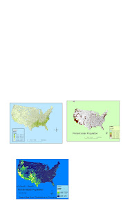
For this lab we had to download data from the US census website and put it into the Arch GIS program. The data started out as tabular, not spatial. Converting the data into a form that GIS could manipulate was the challenging part of this assignment. After the tabular data was converted to DBF files and put into Arch catalog then Arc Map.
The Data from the census was layered over data for the entire countries state boundaries. The data used was population data for different races in the US. Each map represents a different races population distribution for the country in percentage. The legends show what percent population each race coincides with what color on the map.
This lab shows how number or tabular data can be expressed visually on a map using colors and polygons. the main challenge of this lab was organizing and converting the data to a way the Arc Map software could visually represent it. Knowing how to convert files and where to put them is my biggest challenge in GIS so far. It is very difficult for me. Once the information is in the system it is more navigable and easier to combine datas and make data layers. The general tools bar is definitely more understandable to me than the spatial analysis tools. I still don't understand how to get the 3-D models to come up on the map. There are many aspects of GIS that I have yet to understand but this course definitely gave me a good start and somewhat of a working knowledge of the system. I hope that I can master this program someday and be able to effectively use the Arc GIS software to represent spatial data scientifically in order to benefit research projects and communicate environmental issues.

Wednesday, May 26, 2010

Week 8 Lab Station Fire


For this weeks lab I chose to display the Los Angeles county parks with their names and a small map on the bottom displaying the County parks buffer zone and target area of the station fire. I outlined the main park burned in the station fire. This map clearly displays the extent of the Angeles National Forest that was burned in the fire. The fire was almost all within the Angeles National Forest perimeters.
This fire was the largest in Los Angeles County history and destroyed 250 square miles. Two firefighters were also killed during the blaze. It was the ninth largest fire in California since 1933. the are was drought dry forst and the fire spread quickly. the burn area covers much of the San Gabriel MOuntains north of Los Angeles, most of which is within the Angeles National Forest.
The fire burned many recreation areas including hiking trails and campsites. Some campsites were spared but the surrounding areas were still burned. Among the burned areas in the Angeles National Forest are Switzer Falls, LAUSD's Clear creek camp spread, Eaton canyon Park, Gould Mesa campground, Cogswell reservior, Magic Mountain Wilderness, Pleasant View, Millard Campgrounds, Horse Flats, Camp Colby, Hidden Springs cafe in a popular hiking area, Devil's Canyon/ San Gabriel Wilderness, and Angeles Crest Ranger station.
So much of the wilderness areas off the Angeles Crest highway in the Angels National forest was burned. This area was covered with amazing hiking trails and campgrounds. These areas have been closed to the public since the Station fire in September 2009. The area of the burn has been considered very dangerous due to possibility of landslides and severe run-off from the vegetation cover being destroyed. The soils were left bare after the fire, increasing the chance of collapse in a rain or even a slight disturbance. the organic oils left in the soils from the vegetation reduces infiltration capabilities of the soil and increases run-off. this can be vert dangerous to down slope communities.
As of May 26. 2010 some of the areas within the burn perimeter have been re-opened to the public. Only areas that weren't actually burned but surrounded ny burn have been re-opened. it is predicted that it could take years for some of the ares to be re-opened to the public because of the amount of instability and environmental degradation in the burn areas.

refernces

1. www.latimes.com/news/local/la me firemap
Lin Gong Rong. Los Angeles Fire map sept. 11, 2009
2. www.gis.lacounty.gov/egis
All station fire perimeters data. sept 2, 2009
3. www.glendalenewspress.com
Wells, Jason. forest area back in service. may 26, 2010
4. Geology.com/new/2009/stationfire burnarea
sept. 10,2009
5. earthobservatory.nasa.gov/naturalhazards
Allen, Jesse. NASA image.2009

Monday, May 17, 2010


WEEK 7 GIS LAB: Silver Lake and Echo Park areas in LA

The area I chose is the Silver Lake neighborhood of Los Angeles including some of Echo Park. I live near here and it's a beautiful area that most students here have never been to. The latitude range goes from 34.15666 degrees North on the top to 34.041666 degrees North latitude on the bottom. The longitude range is from -118.355277 degrees West on the left to -118.1986111 degrees West on the right edge boundary.

Wednesday, May 12, 2010


Week 6 Lab: Map Projections

Different map projection preserve different aspects of the real world. Every single map projection has some sort of distortion because it is impossible to project a 3-d world perfectly onto a 2-d flat paper or screen.

When measuring the distance between Kabul, Afghanistan and Washington D.C., US on six different map projections, each one was a different distance. Even the two equal distance map projections had different values. I notice that the conformal map projections (Mercator and Miller) had the highest distance at over 10,000miles each. The Equal distance projection (cylindrical) had the lowest value at just over 5,000miles. This is a HUGE difference!

It is very important to choose wisely what map projection to use for what information you are trying to attain. I suppose for measuring distance one should use an equal distance map projection. I would still check for accuracy. Equal area and conformal map projections would be a wrong choice for measuring distance unless it is for a very small area. Most any projection will work well for a small area (ex. Los Angeles), but not for large areas.

Choosing a projection with the least amount of distortion for the area you are concerned with depends on latitude and where the center of the projection is. On the Mercator, the closer to the equator you are, the least distortion, so it would be good for the equatorial regions. A polar projection would be better for the polar regions.

Overall map projections are really cool and useful, especially in the geographic and geospatial world. Maps are the most useful tool for geographers. Learning how to read, create, and manipulate them is the challenge.

Tuesday, May 4, 2010

Lab #4 GIS MAP

The Arch GIS program is truly amazing yet complicated. There are many sections that I had problems with, especially the file locating part. It seemed that every single layer of data and every section on the left hand side (table of contents) had to be individually saved and transferred to the USB or it would not allow me to edit anything.
I would complete everything step by step and go back and the information would be gone! This was extremely irritating and a waste of time.
I was not able to put in the road even though I fully understood how because the "Arterial_new" layer would not come up on my environmental snapping list or target section. I tried saving it to my F drive tons of times and it would not show up. Every other layer showed up, except for the one I needed to. My friend and I worked on it together from start to finish and we both had the exact same problem.
The tutorial was very direct and detailed but it didn't conceptually explain what was happening. I feel that we should have started with the data itself and gone from there. That way we would understand how the data got where it was and what it means in relation to the maps that we were manipulating. I found myself not even really knowing what I had just done even though the map looked the way it was supposed to. I'm sure some other students had the same issues given no prior experience with the program.
The program itself seems very useful and a wonderful tool for presenting spatial data. I can't wait to be able to understand the software and navigate it somewhat smoothly. The ability to manipulate each aspect of the map and add multiple layers is crucial for representing different data on the same map. I love being able to use color to represent different values spatially. Overall, the program seems usable and highly functional. I just hope that I will be able to grasp it and navigate it successfully in the near future.


Wednesday, April 21, 2010

Lab #3 Neogeography

Neogeography means "new Geography." It is a way to personalize and customize map making for your own personal interest. In my case I chose some gardens and farms around LA because I love urban farming and gardening and wanted to show some of the amazing spots around LA. Most people would never think that they could learn about permaculture and organic farming right in the middle of Los Angeles, a huge, concrete metropolitan area. Neogeography can show others specific details about an area that they would otherwise never know or think about. It allows you to put in images and representations of your place of interest other than just a point on a map. It personalizes the map making experience as well as simplifies it. Neogeogrphy also allows you to integrate your personal research into a map. In my case, I researched where the different gardens and farms were and a little bit about them, then placed them on my map. It is a very useful tool.

Thursday, April 8, 2010

LAB #2 Goeg. 7
1. The Quadrangle is called Beverly Hills Quadrangle.
2. The adjacent quadrangles are Hollywood, Topanga, Van Nuys, Venice, Canoga Park, Burbank, and Inglewood.
3. The quadrangle was first created and compiled in 1966.
4. The datum used to create this map are The North American Datum of 1927 for the horizontal datum and the National Geodetic Verticle Datum of 1929.
5. The scale of this map is 1:24,000
6. a) 5cm on the map is equal to 1200m on the ground.
b) 5in on the map is equal to 1.893939mi on the ground
c) 2.64in on the map is equal to 1mi on the ground.
d) 12.5cm on the map equals 3km on the ground.
7. The contour interval is 20ft
8. a) The approximate latitude for the Public Affairs building is 34 degrees, 4 minutes, and 12 seconds north the latitude in decimal form is 34.428 degrees north latitude The longitude is approximately 118 degrees, 26 minutes, and 15 seconds. Decimal form is 118.4325 degrees West longitude.
b) The approximated latitude for the tip of the Santa Monica pier is 34 degrees 0 minutes and 45 seconds. Decimal form is 34.075 degrees North latitude. The longitude is 118 degrees, 30 minutes and 0 seconds West longitude.

c) The approximate latitude for the upper Franklin Canyon Reservior is 34 degrees, 6 minutes, and 15 seconds North latitude. The longitude is 118 degrees, 24 minutes and 50 seconds West longitude.

9. a) The approximate elevation of Greystone Mansion is 560ft/170.8m.

b) The approximater elevation of Woodlawn Cemetary is 140ft/42.7m.

c) The approximate elevation of Crestwwod Hills Park is 800ft/244m.

10. The UTM zone of this map is Zone 11

11. The UTM coordinates at the lower left side of the map are 37 63, or 3763000.

12. Ther are 1000 square meters in each UTM square grid.
13. UTM Northing 371000; Elevation Line Graph

14. The magnetic declination of this map is 14 degrees from magnetic North.

15. The stream between Stone Canyon Reservior and the 405 Freeway flows from North to South.
16. Below is the UCLA campus.


Thursday, April 1, 2010


This is a satellite image of San Francisco hybridized with street names and neighborhoods. I chose this map because I lived in San Francisco for five years prior to moving to LA and I love it so much. I like the use of satellite imagery mixed with street names and places. The source of this map is www.friscovista.com/orientation/san-francisco...


This is an old USGS topographical map of the island of Oahu. The source is the U.S. Geological Survey in Cooperation with the Territory of Hawaii. 1930. the Library of Congress.

I chose this map because I lived on Oahu for four years and am fascinated by its topography. I also love the way these old maps look. The dull colors and fine lines really make you look closely at the information given.


This is a Geologic map of California. I chose this map because the geology of California is very interesting and diverse. It is also very visually stimulating and puts into perspective the massive amount of techtonic activity that California has experienced over long-scale geologic time. This map is color coordinated to show the different rocks present in California based on periods in Geologic history. California is truly amazing when it comes to Geology. The source of this map is the USGS website, URL: http://education.usgs.gov/california/maps/california_geology3.htm